





SCOPE |
: |
Interiors |
CREDITS |
: |
Design Architect: Pei Cobb Freed & Partners Architects LLP
Abby Suckle was the Project Architect & Designer for the Interiors
|
AWARDS |
: |
American Library Association/ American Institute of Architects
Library Buildings Award of Excellence for Library Architecture-1997
Interiors Magazine
Best Library- 1996 |
PUBLICATIONS + EXHIBITIONS |
: |
Architecture Mazazine July 1996
Interiors July 1996
Newsweek Sept 1996
New York Times multiple
San Francisco Chronicle multiple
|
PHOTOGRAPHS |
: |
Richard Barnes, Roslyn Banish, Timothy Hursley, Jane Lidz, Charles McGrath
|
DESCRIPTION
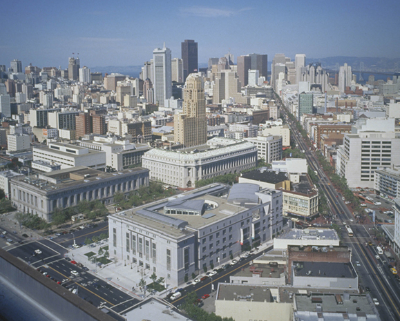
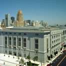
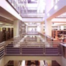
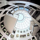
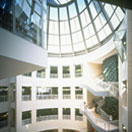
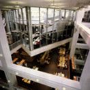
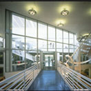
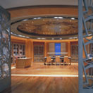
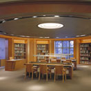
When the City of San Francisco decided to relocate its main library to a new building in the Civic Center in the early 90's, they were interested in creating a 'World Class Library'. Programmatically, the 377,000 sf building fills an entire city block across from City Hall. The floor plan is organized around an atrium of reading rooms surrounded by the open book stacks. Each of the collections can be seen from the Elevator. On the outside are the stacks and carrels with the special collections occupying the corners. There is an auditorium and cafe on the ground floor that can be used off hours.
There were many innovations explored in this building that set the standard for library design. San Francisco, for instance was one of the earliest libraries to have an online card catalog, a transition which was quite contentious at the time. This enabled the cards to be repurposed as a public artwork where the Artists, Ann Hamilton and Ann Chamberlain had San Franciscans write their comments on the books.
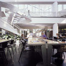
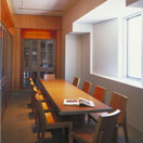
The Periodical Reading Room which hangs over the Atrium was envisioned as a state of the art space for printed and digital media; in addition all of the library furniture was designed with full power and data access at all seats which was one of the first times that had been done. The sycamore and tupelo plywood reading chair was created using a CNC machine, an early use of that technology in furniture design. The structural system, a base isolation system, conceptually a 'box in a box', was designed for earthquakes and one of the first times it was used in such a large building.


